
Welcome back to The 2x2 - the ultimate newsletter for executive consultants!
After a long and busy year, my team is on a well-deserved break this week.
They left this week’s newsletter to me.
So instead of our usual issue, I decided a cringe-fest was in order.
Chart Crimes – a festivus for the rest of us!
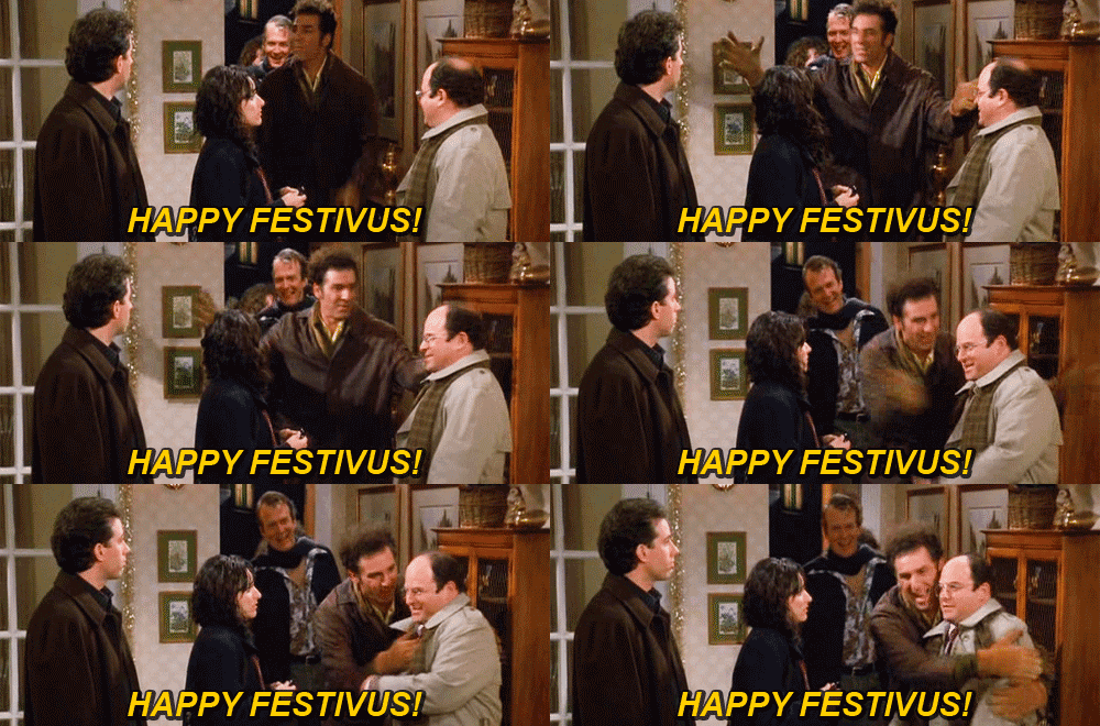
Giphy
First off, slice your holiday pie to give stress, anxiety, and depression.
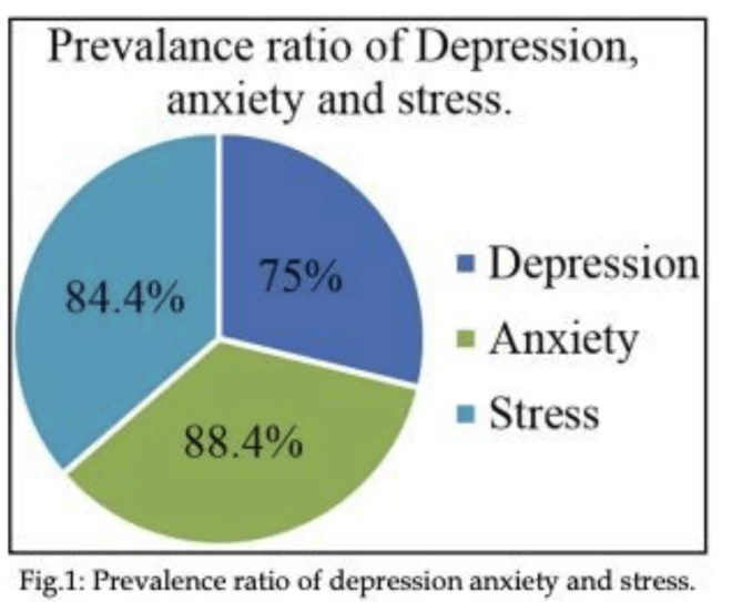
If only we could also invoice that 247.8% rate.
Next, this confusingly colorful bar graph makes me...wtf.

If you’re going the extra mile, don’t let it be for something this heinous.
Next, this slide probably took someone a full day to right-left-center align.
Ctrl+NOPE.
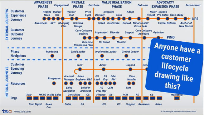
The more you look at this chart, the worse it gets.
No actual flow, no organization, no clarity on the words, no nothing.
This next one personally pains me.
Don’t combine art and science, especially if you’re still using calculators and highlighters.
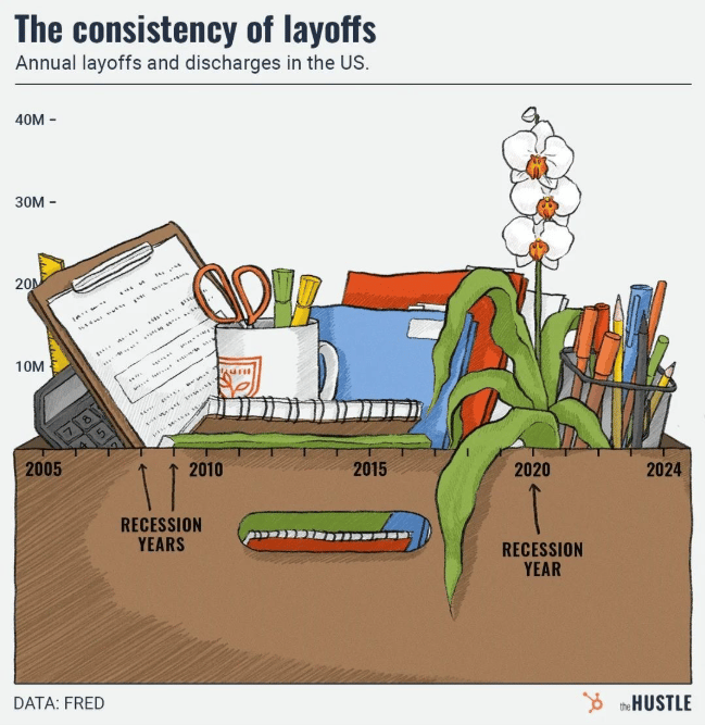
I hope the desk contents were boxed up to usher this person out of the building.
And finally, this one is like a botched CT scan.
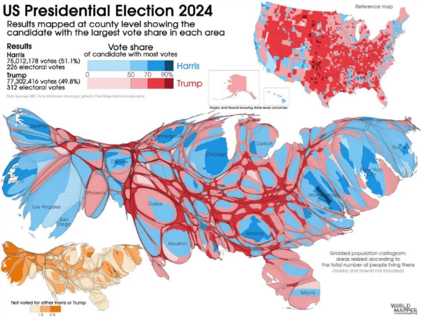
Hope you enjoyed these horrible, horrible charts.
Happy Festivus!

P.S. Have you spotted a chart crime in the wild? Send them to us at [email protected].

Remember, the path to success is paved with continuous learning and embracing fresh perspectives.
Let's stay connected, share ideas, and elevate your consulting business.
Stay curious, friends.
The 2×2 is brought to you by Keenan Reid Strategies
Having trouble viewing this email? Check out this and past issues on our website.
Was this newsletter forwarded? Someone is looking out for you. You should definitely subscribe!
